Brand Identity Project – Bar Romagna

BAR ROMAGNA
Brand Identity
Friendly cafeteria which focused on kind breakfast and cool events in the evenings located in Italy
About

Bar Romagna is an Italian bar that aims to be a welcoming, fun, and pleasant place, described by one of their owner Nadia as “the perfect break” during breakfast. Nadia and Mattia have been welcoming thousands of people for 18 years and organizing events dedicated to fun and celebration.

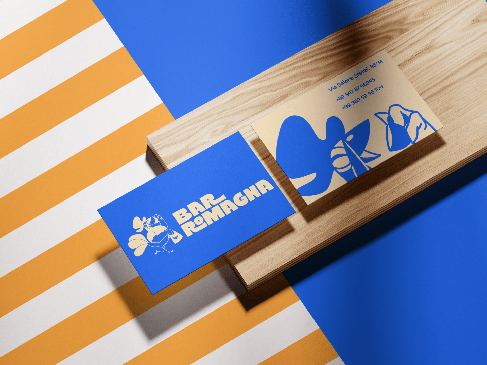
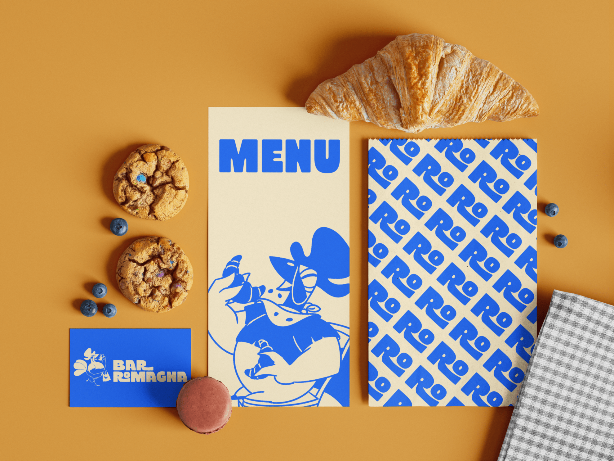
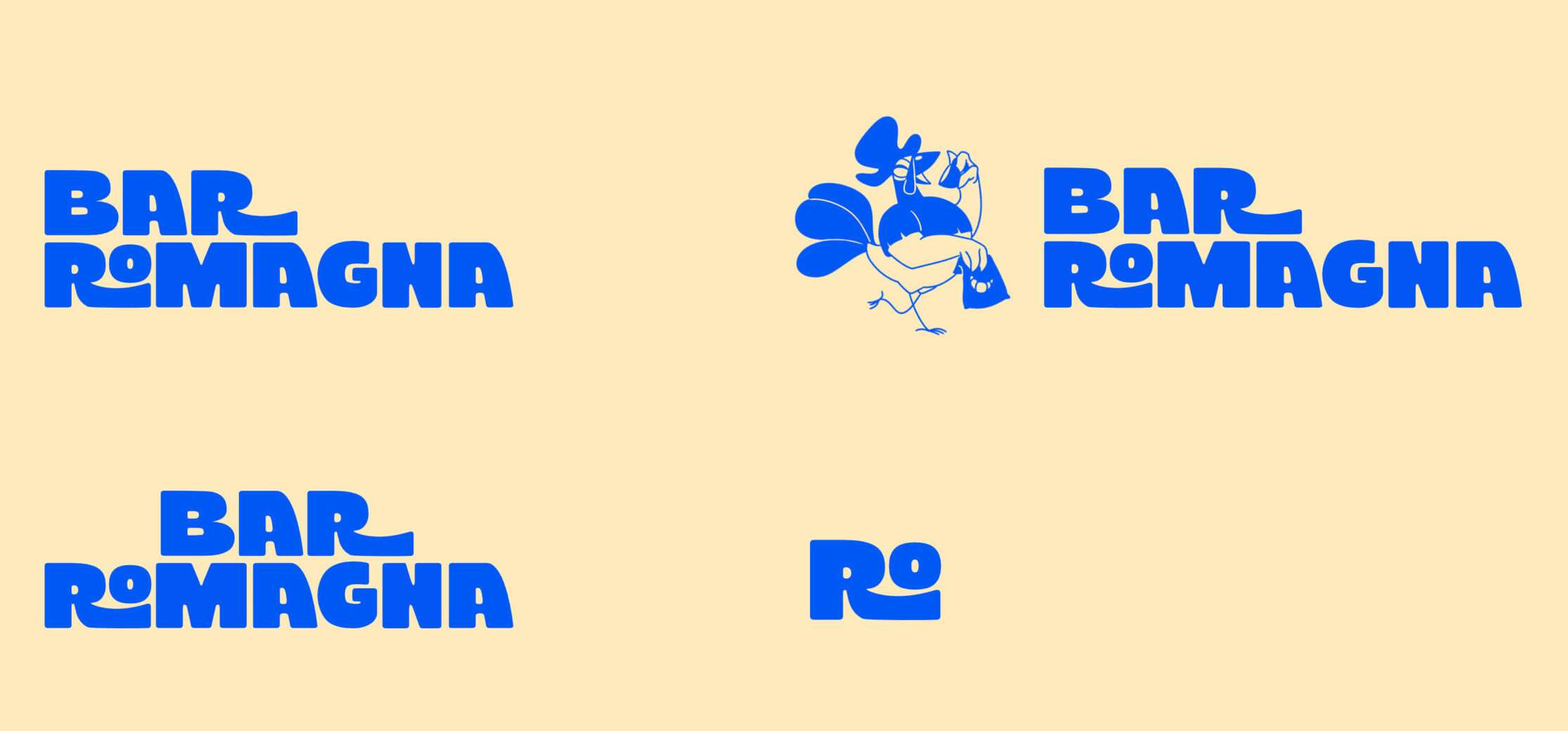
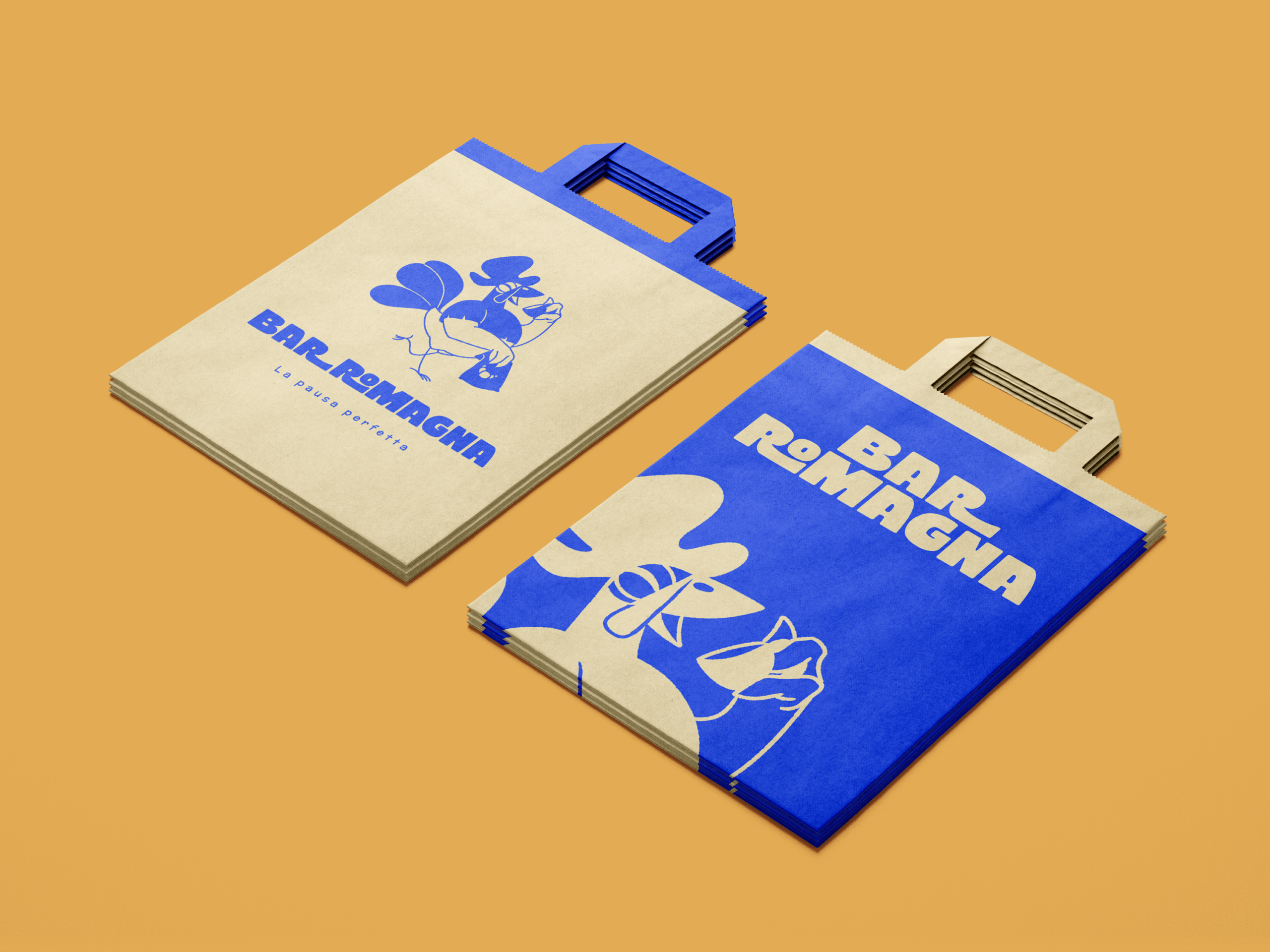
BRAND IDENTITY · MERCHANDISING · ILLUSTRATION ·

VERBAL IDENTITY
HAPPINESS
JOY
FAMILY
FRIENDLY
WELCOMING
The main objetive is offering a welcoming and pleasant space for anyone who wants to have breakfast, eat, or enjoy a relaxing break. Its audience flows between 35 to 70 years old.
LOGO AND MASCOT

The main logo is based on a kind and joyful typography plus its representative cock from Emilia-Romagna region, using a traditional image to attract more traditional audience.

CLEAR SPACE & LOGO VARIATIONS

MASCOT EXPLORATION

COLOR PALETTE & TYPOGRAPHY

Taking the colors of the Cervia's flag was necesary to connect with elderly people as the mascot and logo seems very modern. The blue and yellow represent its traditional flag, plus it distinct the cafeteria itself.

The main font was used to menu titles and its logo and "McLaren" for texts in the menu.

MERCHANDISING

What is a cafeteria without its representative cups of coffe? We need those and also some t-shirts plus caps to show everyone this wonderful place.

SOCIAL MEDIA

A few templates were needed to post especial events, menus and explicit messages to its social media on Instagram. As average age of its clients are very high, a big letter size is essential for accesibility.