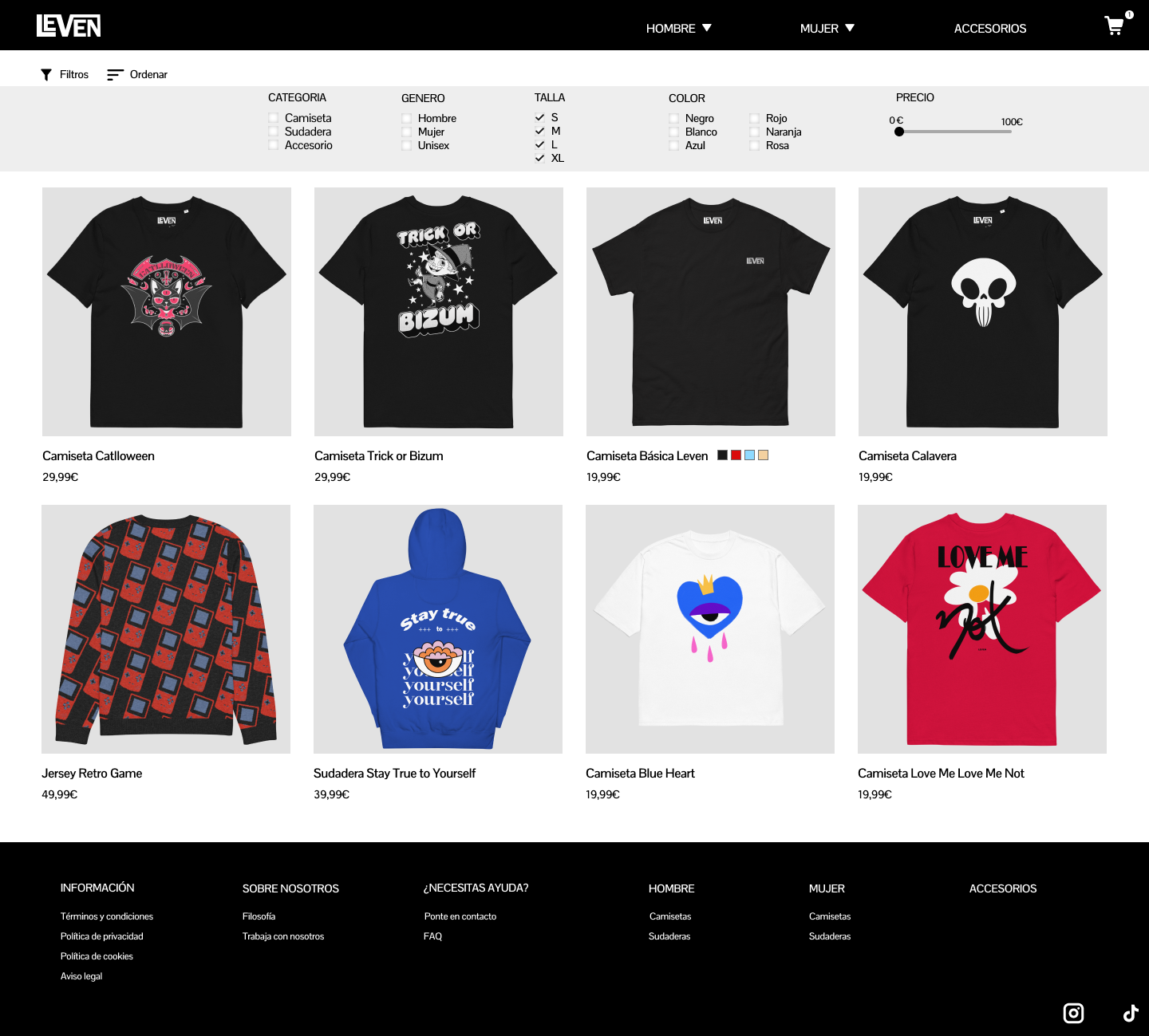
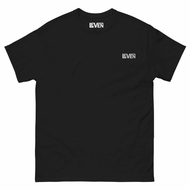
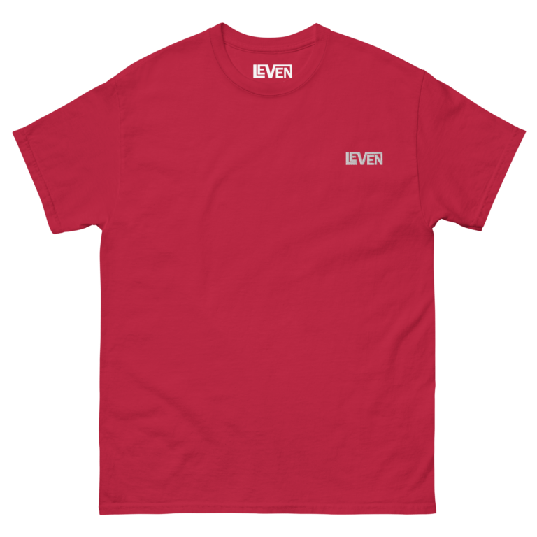
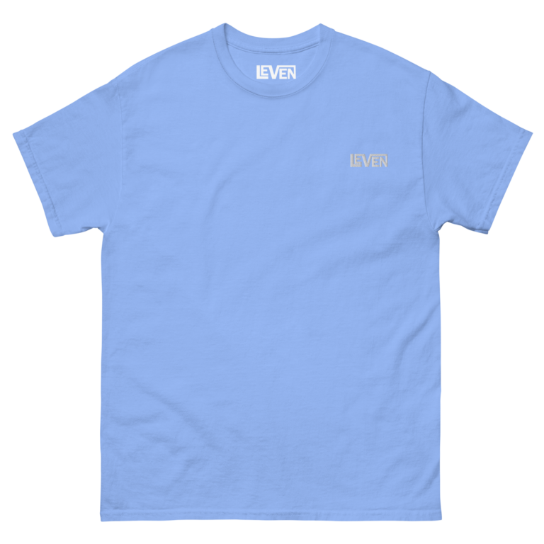
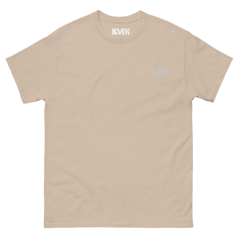
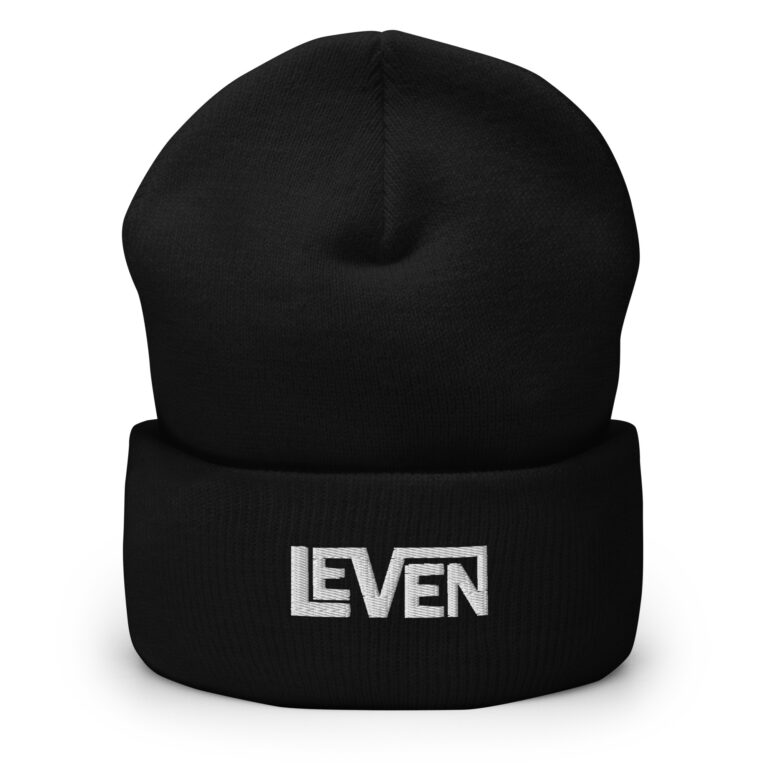
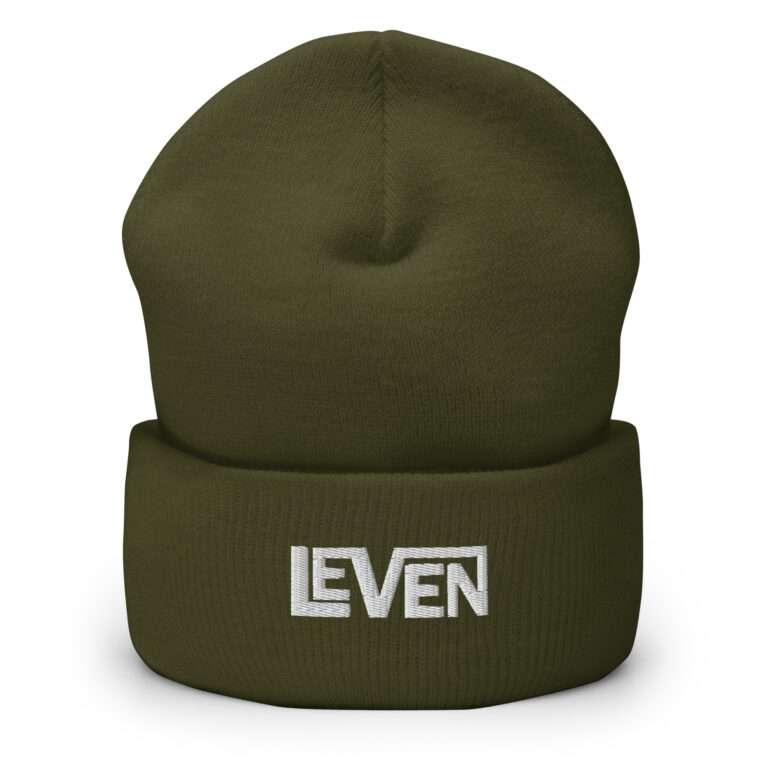
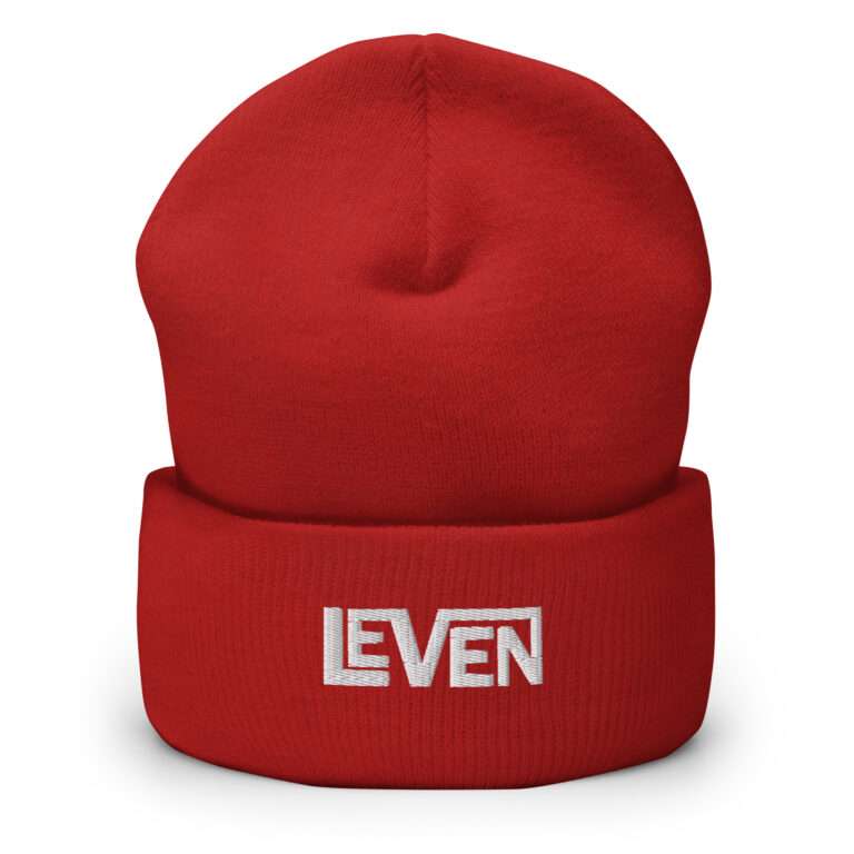
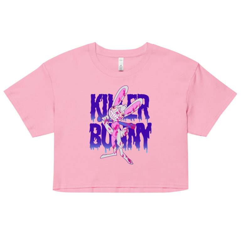
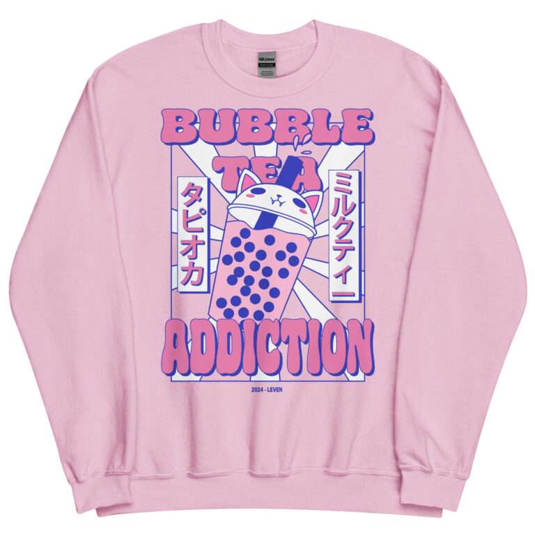
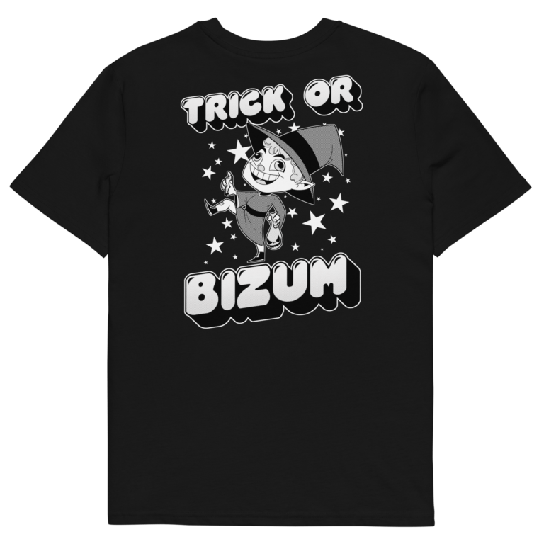
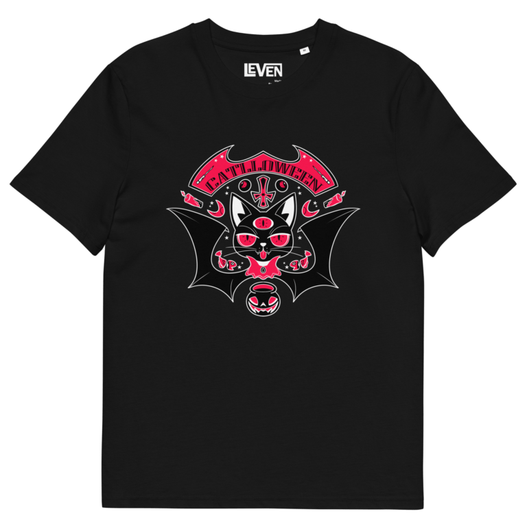
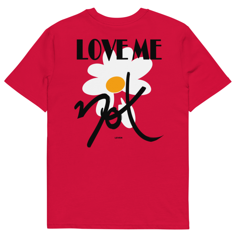
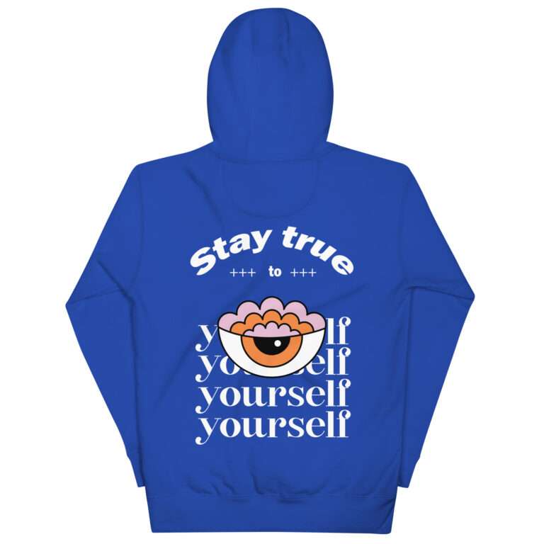
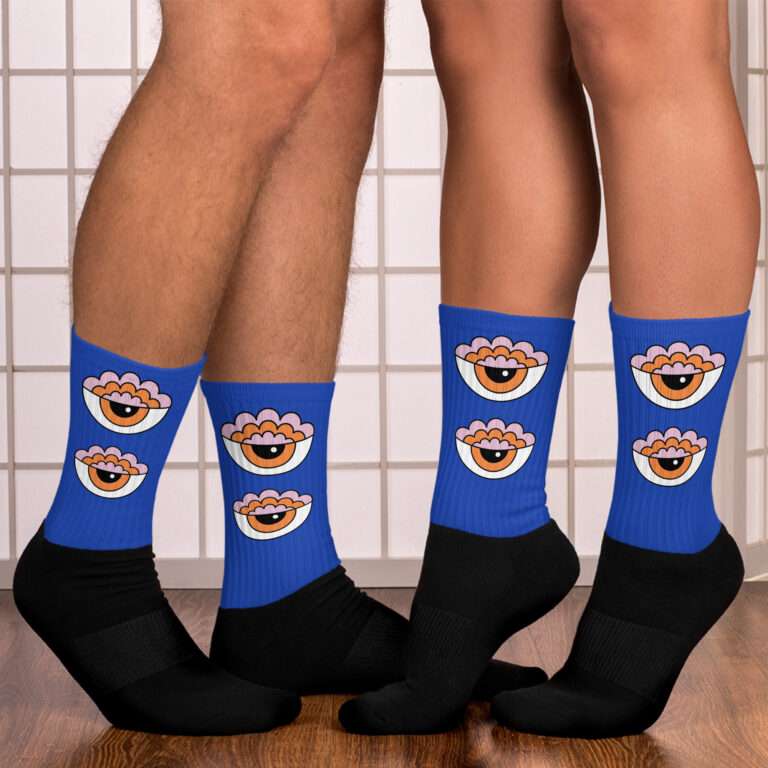
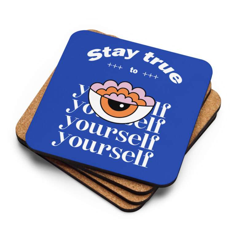
Leven is an online shop focused on t-shirts and hoodies based in Madrid by Luis Gonzales. The main purpose is to design cool, unique and funny designs using high quality fabrics plus economic prices which can reach to anybody.
UX/UI · WEBSITE DESIGN · BRANDING · E-COMMERCE ·
UX/UI · WEBSITE DESIGN · BRANDING · E-COMMERCE ·
UX/UI · WEBSITE DESIGN · BRANDING · E-COMMERCE ·
UX/UI · WEBSITE DESIGN · BRANDING · E-COMMERCE ·
UX/UI · WEBSITE DESIGN · BRANDING · E-COMMERCE ·
UX/UI · WEBSITE DESIGN · BRANDING · E-COMMERCE ·
UX/UI · WEBSITE DESIGN · BRANDING · E-COMMERCE ·
UX/UI · WEBSITE DESIGN · BRANDING · E-COMMERCE ·
UX/UI · WEBSITE DESIGN · BRANDING · E-COMMERCE ·
UX/UI · WEBSITE DESIGN · BRANDING · E-COMMERCE ·
UX/UI · WEBSITE DESIGN · BRANDING · E-COMMERCE ·
UX/UI · WEBSITE DESIGN · BRANDING · E-COMMERCE ·
Leven seeks and impact based on their illustrations which means design is essential in order to sell products.
Moreover, the quality of fabrics must be above public expectations. Softness and durability are their bare minimum aspects.
The clothes must make their public feel cool and comfortable. Young people are their main target both men and women.
- Enjoy illustrations as much as their product
- Buy sustainable fabrics
- Feeling young and cool
- Fast and boring designs
- Unsustainable consumption
- Low-quality products
- New perspective about t-shirt design
- Suistainability
- Comfortable products
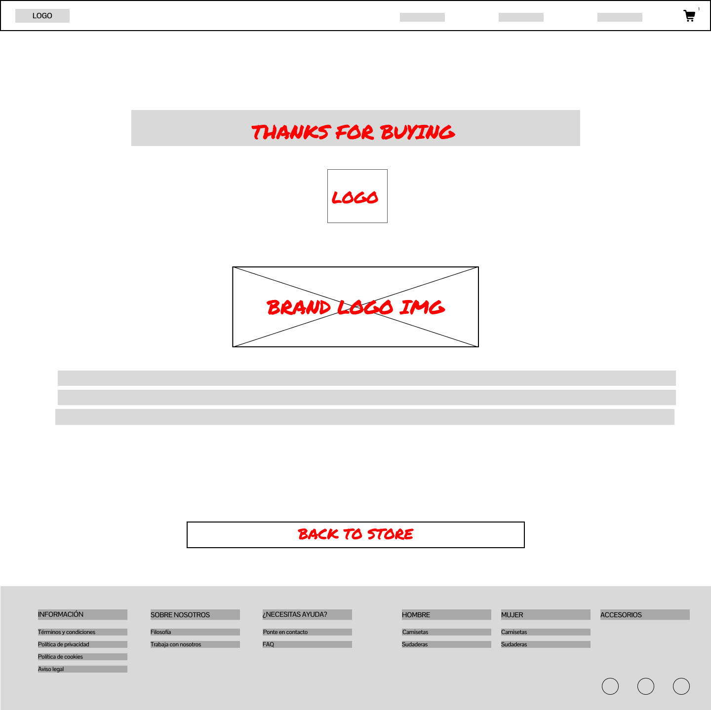
Designed a sitemap to understand and clarify every section of the webpage with direct actions. Footer was organized to have elements that complements the page itself and provides useful information besides clothes section.
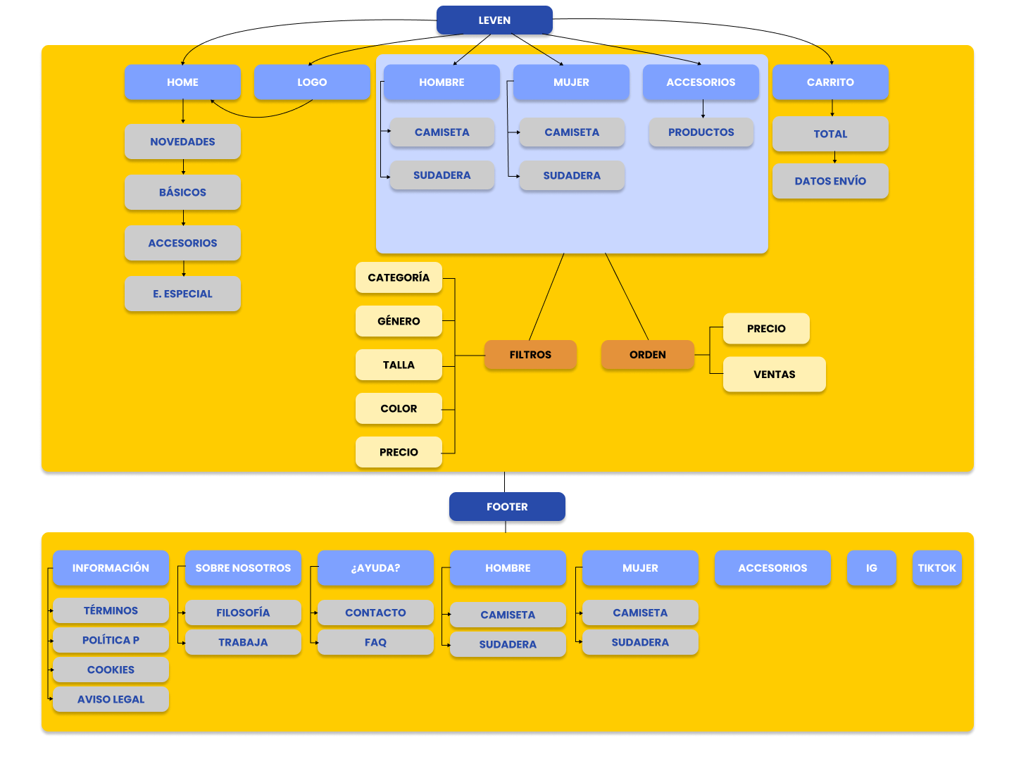
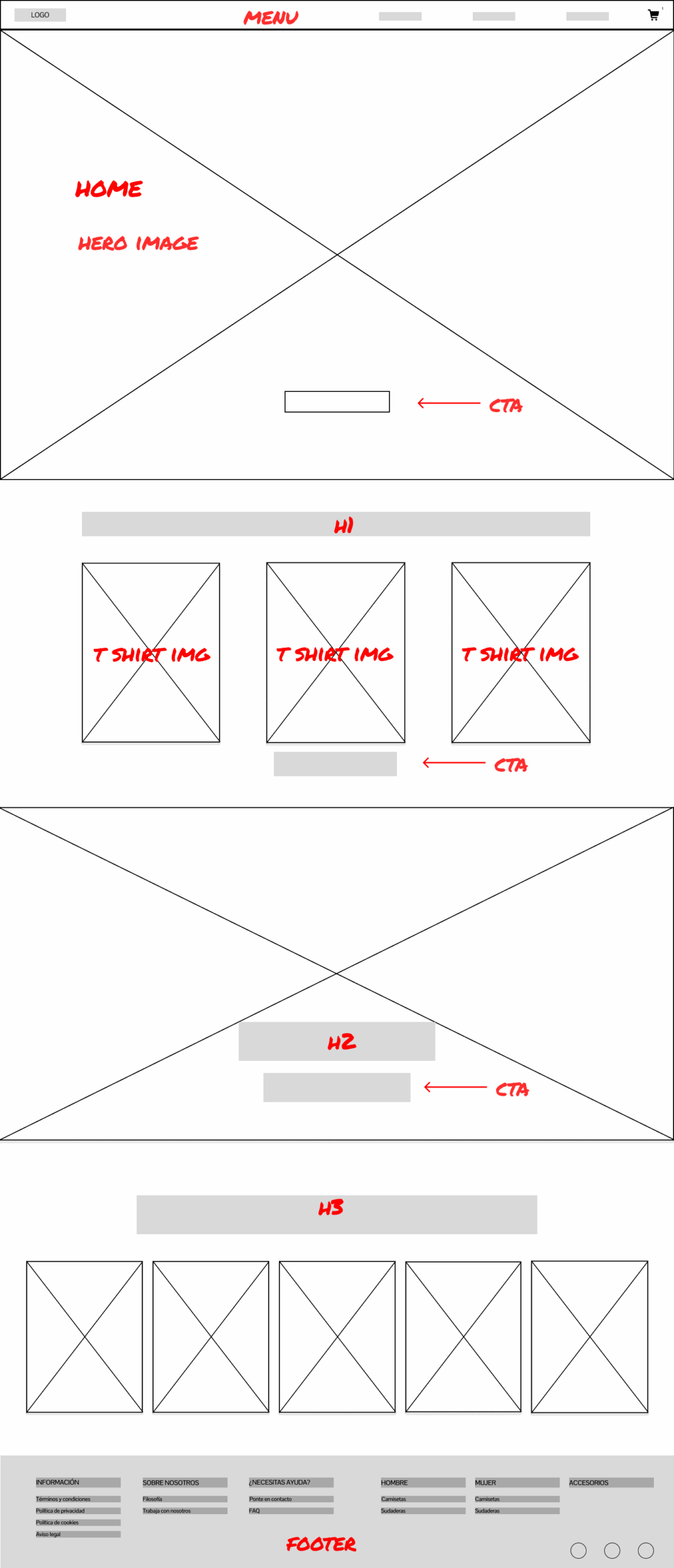
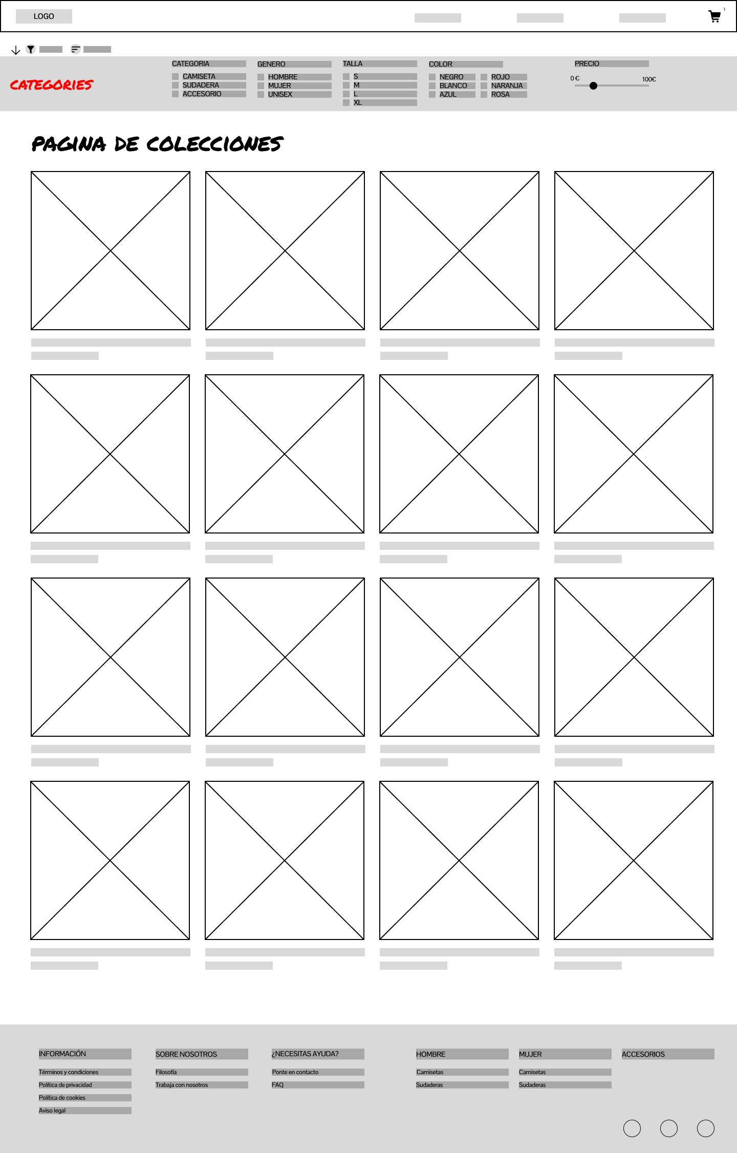
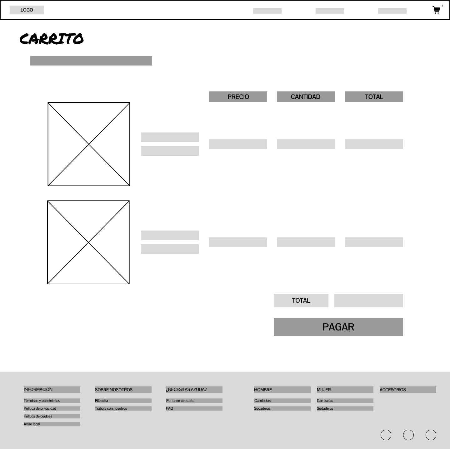
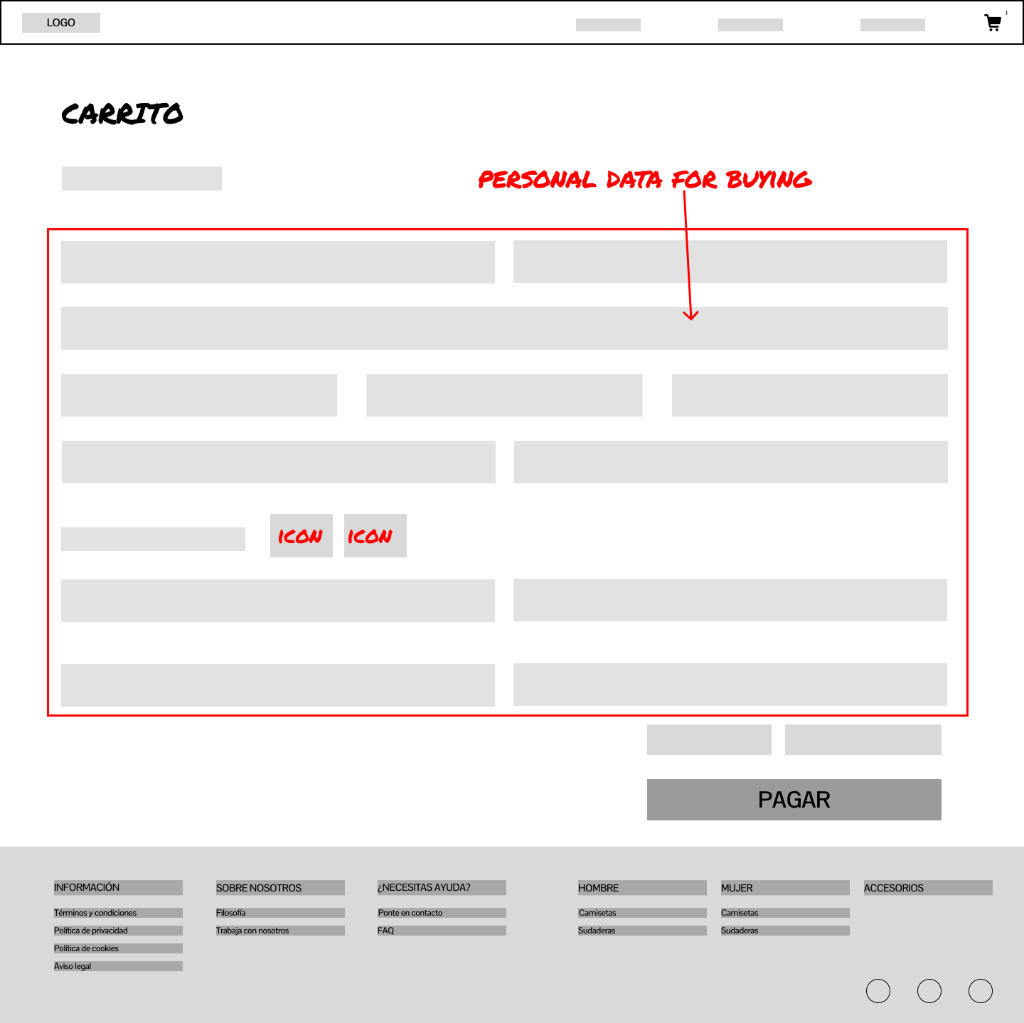
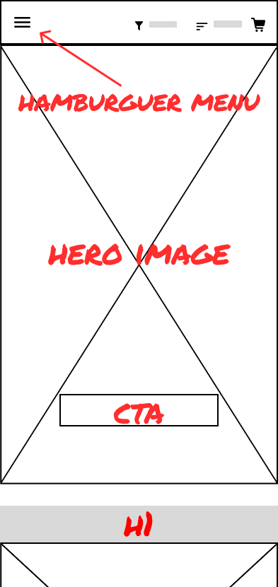
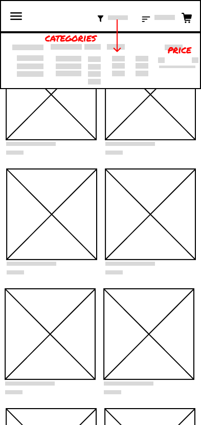
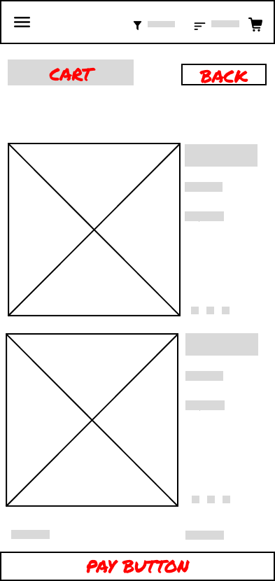
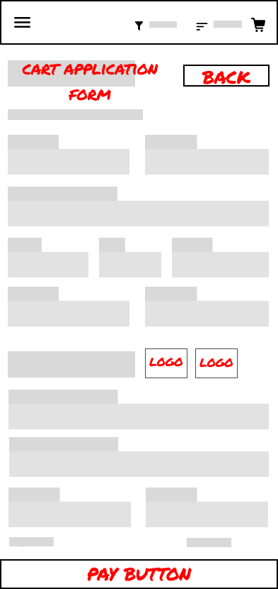
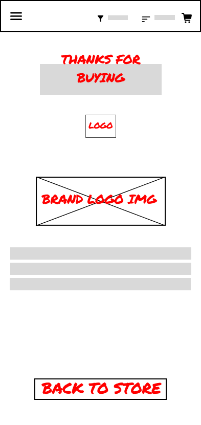
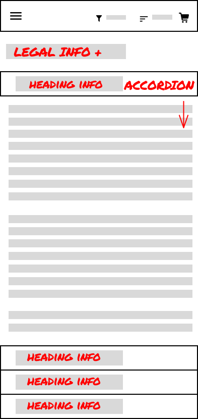
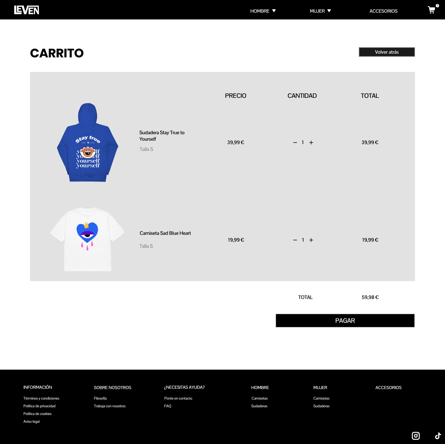
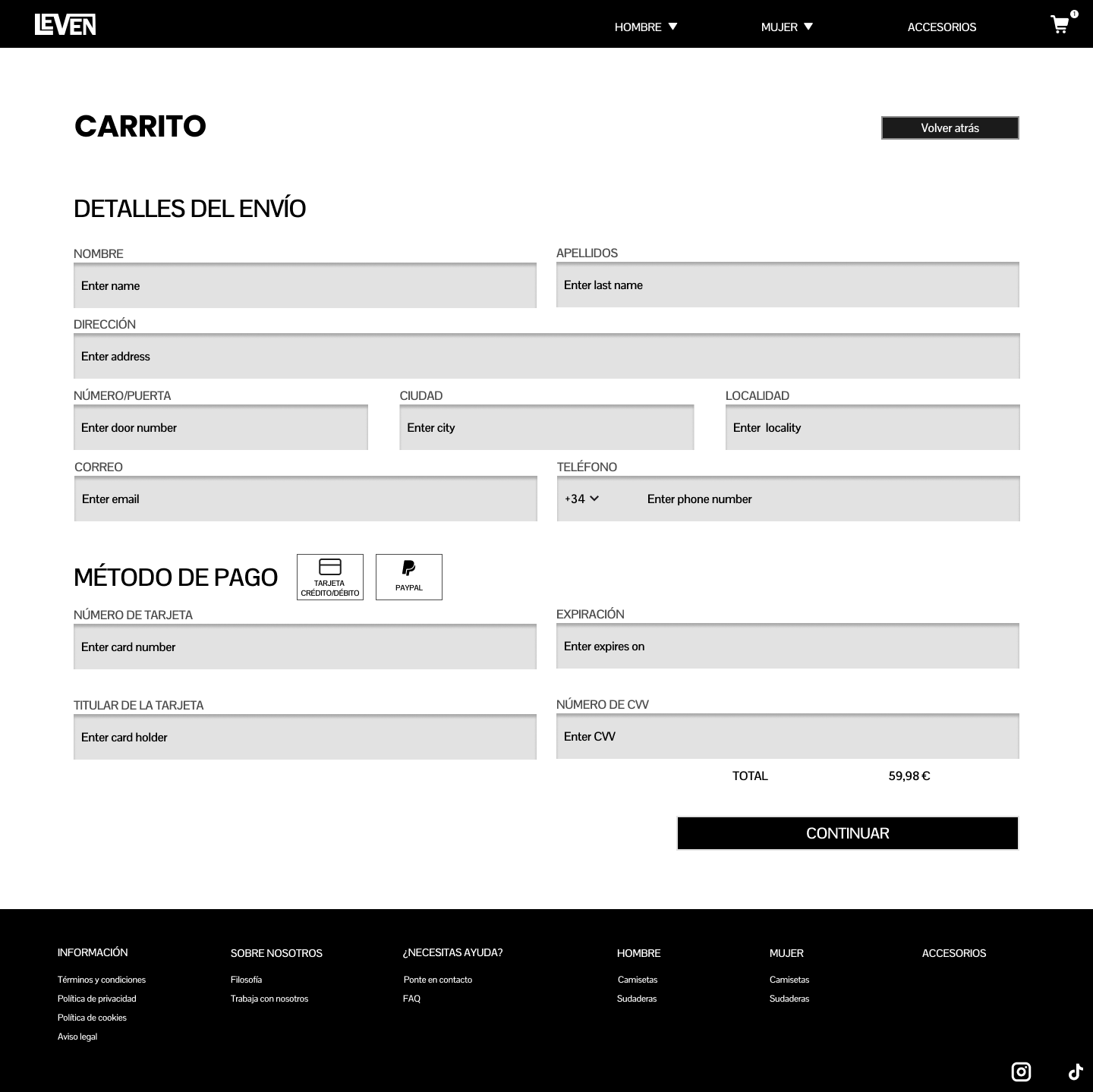
In order to understad the website It was needed a visual guide to organize all the elements. Low fidelity and high fidelity wireframes were needed.
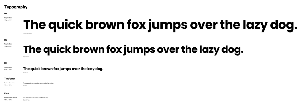
As the webpage style stays clear to focus on the products I did a very minimal design system using components in Figma, which allowed me to speed up the creative process. With this components I can show or hide elements as icons or modify instanly the base of the buttons, checkboxes or the prefix on the phone box.
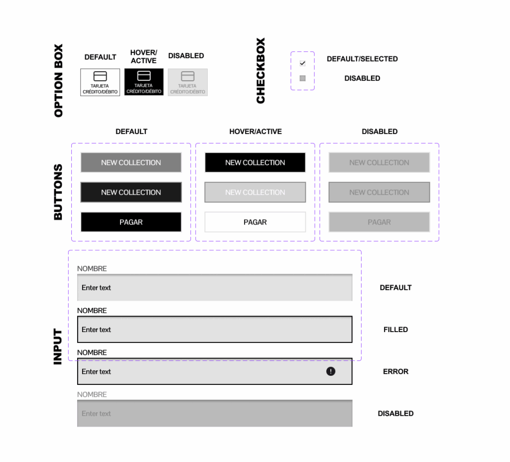
Here we can see why we made different versions for the buttons. The hero image has a semi transparent button but this will not have the same impact with the white background so a black version was needed.
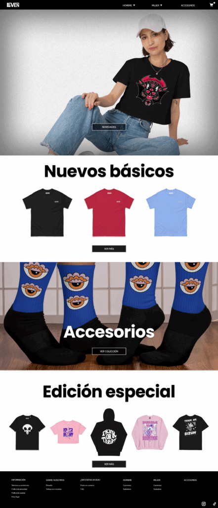
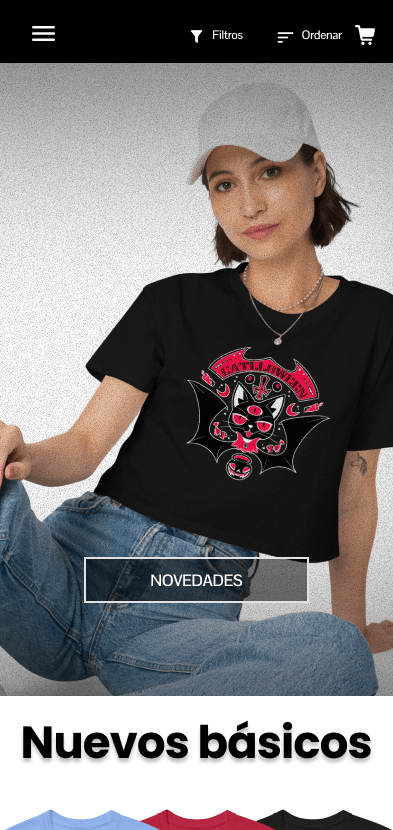
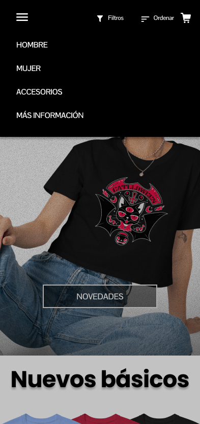
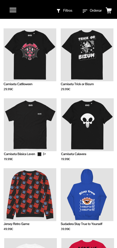
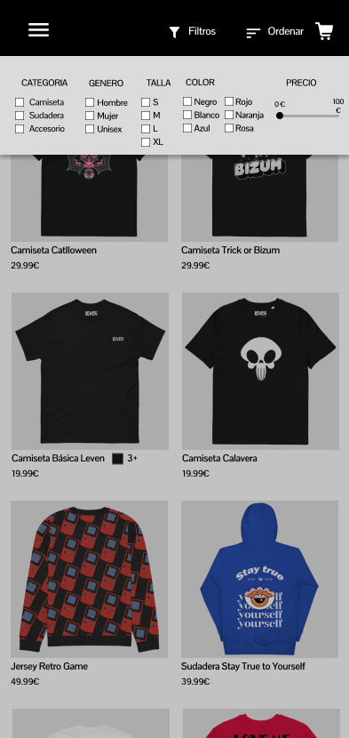
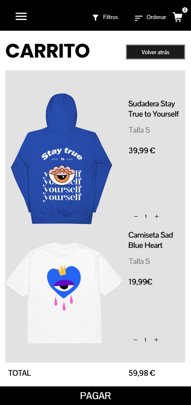
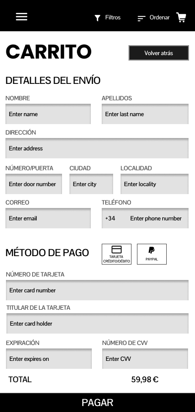
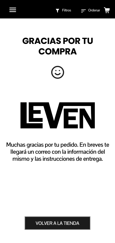
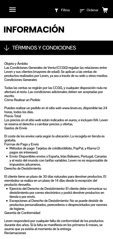
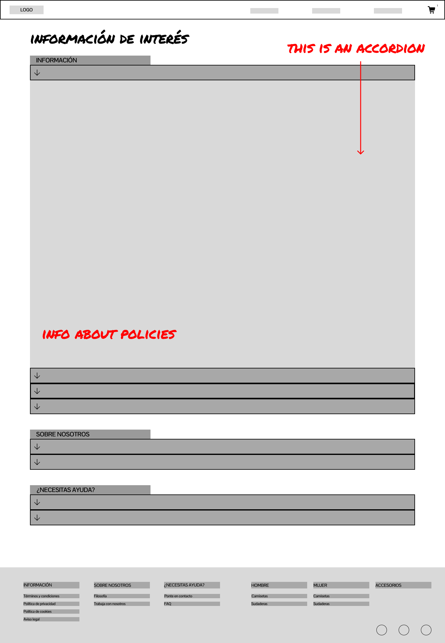
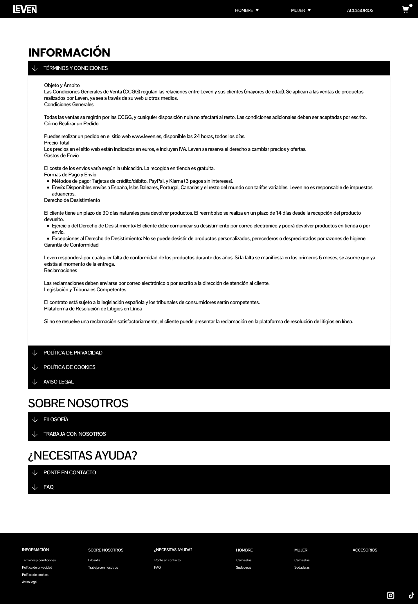
The footer has more information for the users so they can satisfy their doubts about legacy or cookies policy plus a way of contacting Leven directly. In mobile devices that section can be found on the hamburguer menu.
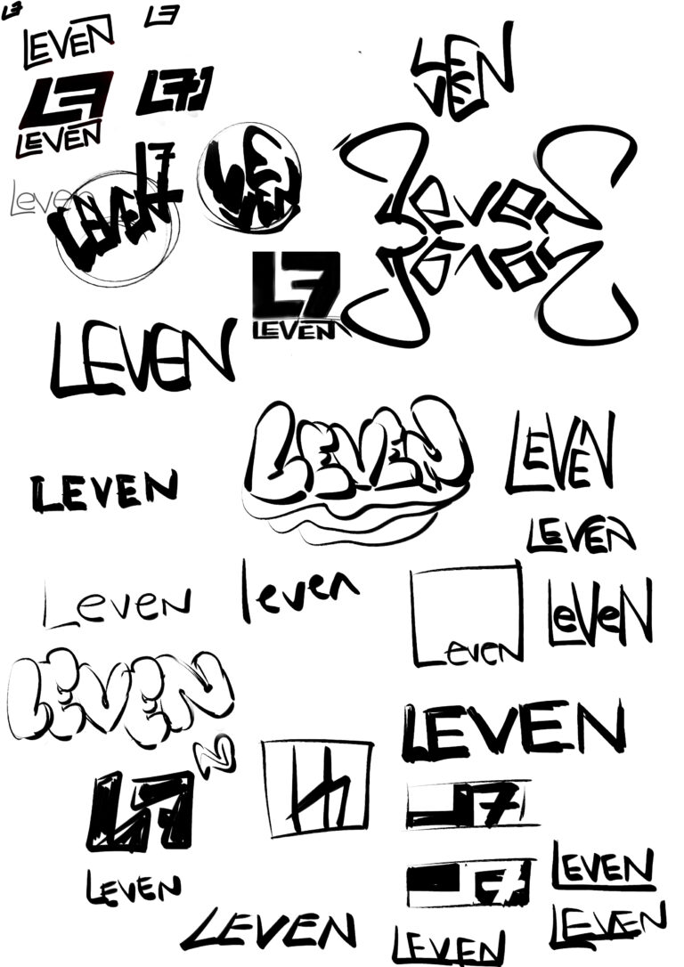
Following the idea of minimalism the logo responds to a very clear image. These early sketches are very similar but I decided to chose something that connects with the letters itself. Leven is a mix of "Luis" and "seven" which number referes to his birthday date. Finally the letter L was chosen to lead the logo plus "seven" taking off the first "s".
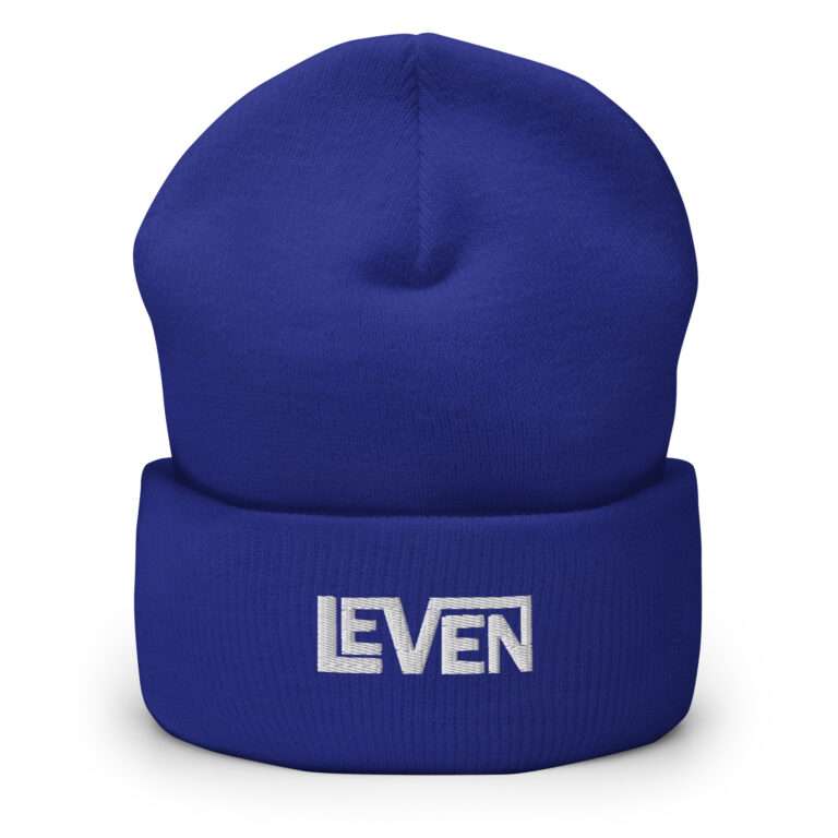
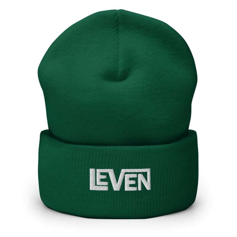
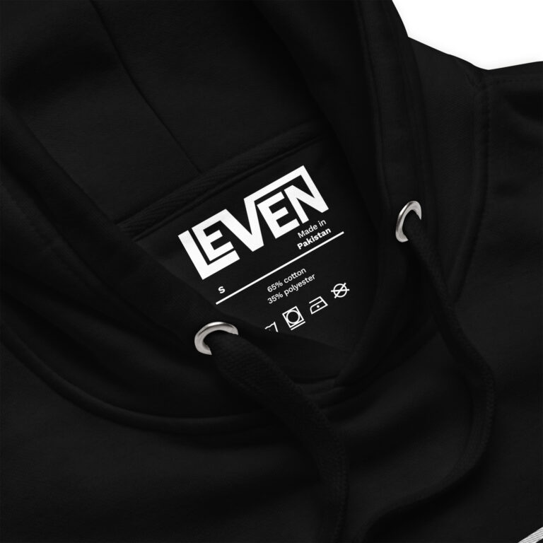
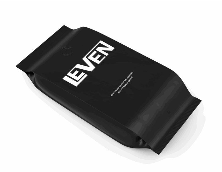
Leven final logo was made in Illustrator, so a high quality archive can be used on different mockups.
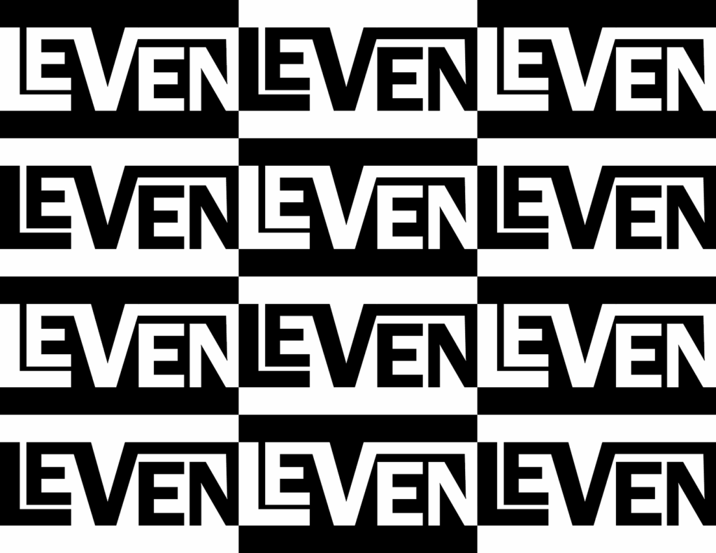
Leven final logo was made in Illustrator, so a high quality archive can be used on different mockups.
